Power press: Fixes for Apple’s oddly-placed Mac mini button


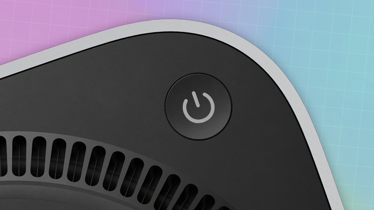
Apple’s decision to place the power button of the M4 Mac mini underneath has been questioned by users. In some cases, they’ve come up with their own “solutions” to the problem.
The introduction of the M4 Mac mini was welcomed by critics, with the already small Mac made to be even smaller. Getting to that size meant there had to be a compromise, and that took the form of an awkward power button placement.
Rather than at the rear, the button is instead underneath the corner of the Mac mini’s enclosure. It’s in a position that you have to lift or tilt the Mac mini to access it, which can be awkward for people with larger digits.
Continue Reading on AppleInsider | Discuss on our Forums
Source: AppleInsider News
Recent Posts
Will the iPhone 17 Air really convince people to upgrade?
At this point, pretty much all the rumors hint at Apple launching a new ultra-slim…
Photographer Reuben Wu’s ‘Thin Places’ Combines Creativity, Drones, and the Fujifilm GFX100RF
Photographer Reuben Wu created a new project, Thin Places, using the brand-new Fujifilm GFX100RF. With…
Another rare, functional Apple-1 has sold for $375,000 at auction
A collection of Apple goodies has wrapped up, with a working Apple-1 taking the top…
iOS 18’s Photos app got a lot better when I made this one quick fix
Apple made a lot of changes to the Photos app in iOS 18. Fortunately, there…
Amazon May Be Close to Finding Its New Bond Managers
Amazon may have found the proverbial M's for its stewardship for James Bond in the…
DJI Ronin’s Legacy of Innovation for Creators and Filmmakers
DJI’s Ronin series of gimbals for DSLR, mirrorless, and compact cinema cameras changed how creators…


